VHI MOBILE APP & WEB APP


THE CONCEPT
Project background
The Vitality Health International (VHI) product was created as a new business channel for Discovery. The aim of the product is to provide comprehensive health insurance to people throughout Africa and thereafter globally. The product is available to companies who will take health insurance out on behalf of their employees.
This product is a new department within Discovery and therefore everything for the system was created from scratch.
VHI makes use of partner insurers based in the regions which facilitate the insurance within the relevant countries. This means that the VHI system is required to integrate with multiple partners.
Problem Statement
To design a web application that allowed a member of the VHI product to sign in to the system in order to access relevant information for their medical insurance. The member needed to be able to easily find the information, documentation, or action they were looking to complete. This website would need to facilitate the user being able to complete actions in regard to their medical insurance without having to contact the help center.
We also needed to overcome constraints in regard to integrating with the D2HP (Connected Care) team as well as the PWA functionality.

Use Case
In part due to the nature of the environment, the Discovery phase of the design practice was not given high importance. We had very little information about the users as this was a new product and the users were yet to be defined. The information we did have was that they fell in the higher income bracket and they would have an understanding of technology and apps.
The users of the app are employees belonging to a group-administered scheme. These users would make use of the app to access and peruse anything related to their policy.
The Goal
The goal is to design a user-friendly web application that enables VHI product members to sign in and access their medical insurance information and complete relevant actions without the need for help center support. The application should facilitate easy navigation and intuitive access to documentation, information, and desired actions. Additionally, the design must integrate seamlessly with the D2HP (Connected Care) team and support Progressive Web App (PWA) functionality.
MY ROLE ON THE PROJECT
I was part of a team of three designers that collaborated on multiple internal and external digital products within the VHI environment. My role encompassed a range of responsibilities including:
-
Research
-
Requirement gathering and analysis
-
UX strategy development (including wireframing, low fidelity prototyping, journey mapping, info architecture, and site mapping)
-
UI design
In addition, I actively engaged with various stakeholders across the organization, facilitating requirement-gathering workshops, collaborating on feature definitions, and conducting design reviews. My contributions ensured the successful completion of each project and fostered a positive relationship with all relevant parties involved.
PROJECT KICK OFF
When I joined the team, we were in the process of spinning up and securing key resources. In the absence of an analysis team, our design team stepped up to fulfill the role of business analysts. As part of this effort, we met with various stakeholders to determine their requirements and conducted competitor research by examining other products in the market.
Given the early stage of the project, much of our initial work was self-initiated and self-driven. We conducted workshops, created journey maps, and engaged in wireframing and low-fidelity prototyping to conduct early validation of our proposed solutions. This allowed us to refine our designs and ensure alignment with stakeholder needs and project goals.


THE UI
The Colours:
At the time of our engagement with VHI, it was a new addition to the Discovery ecosystem and had yet to establish a definitive brand identity. Our design team was tasked with defining the look and feel of the digital product from a rudimentary brand guide, which included only three colors and a logo. This involved establishing a comprehensive brand identity that would impact all aspects of design, rather than just the UI/UX team.
Leveraging the limited brand guide, we methodically deconstructed it into its individual components and utilized them to create the UI for the Member App. To ensure adherence to accessibility requirements, we utilized the EVA Design Systems tool to create a comprehensive color palette consisting of 63 hues. This included the primary color, determined to be orange, along with secondary colors such as pink, success green, warning orange, and danger red. Overall, our efforts yielded a robust brand identity that supported VHI's strategic goals and visually distinguished the product from its competitors.
Accessibility Requirements:
We operated under stringent accessibility requirements during the design and development of the app. Each and every aspect of the application was required to meet the Web Content Accessibility Guidelines (WCAG), ensuring that users with disabilities could access and use the app with ease. This necessitated a thorough and comprehensive review of every design element, including colors, fonts, contrast ratios, and navigational elements, to ensure they met or exceeded the applicable standards.
Our design team was cognizant of the importance of creating a visually appealing and engaging app that would attract and retain users. However, we also understood that the design could not come at the expense of accessibility. To that end, we took great care in selecting colors that met the WCAG guidelines while still providing an aesthetically pleasing look and feel.
.png)
THE UX
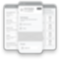
The medical insurance product we designed and developed was distinctly unique when compared to the existing products available in the South African market. While the logic and requirements of the app were not overly complex, presenting the vast and intricate information architecture in a clear, concise, and easily digestible manner presented a significant challenge.
With a plethora of complex information that needed to be displayed, the designs had to showcase this information in a streamlined and condensed form that was both readable and easily understandable. To that end, we engaged in several activities that included but were not limited to, workshops with stakeholders to ensure their requirements were incorporated, extensive information architecture planning to identify and streamline key information, journey mapping to visualize the user's journey, and low-fidelity wireframes to validate our solutions early in the design process. These activities allowed us to create an app that provided users with an intuitive and user-friendly experience, effectively communicating the essential information they required without overwhelming them.

DESIGNS


RTL DESIGNS
One of the POCs we undertook involved creating designs and a demo for a Hebrew version of our member application. Since Hebrew is a right-to-left (RTL) language, we had to make significant updates throughout the entire application to ensure it reads correctly from right to left. This included modifying all copy, icons, alignment, and UX logic to accommodate RTL viewing.
To accomplish this, I had to conduct thorough research and adhere to RTL design guidelines. For instance, arrows that typically point forward in a left-to-right (LTR) design needed to be reversed in the RTL design to maintain the same directional movement. It was a bit of a mental shift, as most of the design elements had to be changed, while certain aspects, such as video progress bars, needed to remain consistent.